Monday, November 5, 2018

Primary Source Info

Printed in The Functional Art, A. Cairo interviews Jan Schwochow, of Golden Section Graphics. Jan discusses primary source information and how many publishers miss many details of a story in a rush to publish.

In the rush to publish after a major event like a terror attack or natural disaster, journalists will often overlook key details or simply make up facts to fill in the story. A frighteningly enlightening graphic of his shows how in the scramble to publish about 9/11, the majority of the sites publishing showed incorrect trajectories of the planes (below). When creating a visual representation of an event, primary photographs and video are unbeatable. ike a game of telephone, the truth can often be muddled by being passed along a chain of reporters.


Jan left his information desk to start his own infographics company in part because of the many errors in reporting he observed while in the media. Jan likes to pursue "projects of love" on which he will gather primary information for much longer than the typical reporter will. One of his most famous projects focussed on the Berlin Wall. For two years he gathered every detail on the shapes of characteristic objects, the confirmed timeline, maps, testimonies, and any other details he could get a hold of. The project ended up turning into a published story in In Graphics and as a museum display. More importantly, the account represents the most true-to-story account of the Berlin Wall Jan can provide.

Monday, October 29, 2018

Personalized Graphics

Our world is more connected with each passing minute. 7.7 billion people use many times that number of devices, creating a exponentially growing digital signature. Our data not only describes who we are, but what we have done and where we have been, what we like and what we want, and what we are likely going to do or purchase next. In the last decade it has become clear that these mountains of qualitative data drive the world economy. Something making up such a significant portion of our lives should be visualized, right?

A modern neural network might pick at all the numbers describing our lives to learn our behavioral trends. This may in turn become another data point to sell to marketers. As humans, it's nearly impossible to glean meaningful insight from a set of numbers. A journalist can bring insight to the reader via a graphic, and can bring a certain creative human element a machine might not be able to. An automatic tool will likely fit a set of points into a prepackaged plot, and may offer a description of a trend. It cannot however critically evaluate the data on an entry by entry basis like a human can.

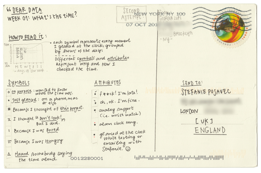
In her "Dear Data" postcards, Giorgia Lupi shows her habits of looking at the clock. It's easy to record what times she looked at the clock, but simply recording a list of times is uninteresting and uninsightful. She instead puts a twist on the visualization by including what she was thinking each instance she checked the time. This perspective provides us a look into her mood throughout the day, her general schedule, and even shares some of her personality.

Image result for dear data time
Image result for dear data a week of clocks

Plug and play visualization tools may be quick and easy to use, but will present the driest data. In a world where we are surrounded by trillions of numbers, there will be dozens of ways to visualize all aspects of life in an interesting, creative way.

Wednesday, October 24, 2018

Elements of a Misleading Graphic

The internet is a vast wasteland of media sites vying for individual attention. It often seems that writers for these sites will employ any means neccesary to grab a reader's attention. In many cases, the flashy object to pull in that reader will be an information graphic. Flashy and colorful, a graphic might command the fleeting attention of a revenue generating reader by raising an interesting question or providing insight into a topic the reader finds interesting. The attentive reader may be able to identify many of these for what they are: advertisements rather than tools for communication.

Sure, many of these may be factual and insightful, but if their primary objective is to draw attention, you can bet your bottom dollar that many will be incorrectly displaying the data, or may be intentionally misleading if they are made to support a specific argument. Cognitive bias proliferates across internet forums for hot issues in social trends, politics, and religion. Writers are encouraged to create a graphic misrepresenting the data if it supports their opinion or argument. (See my post on 8/28 for an example of a misleading political graphic.) These graphics do not need to be blatantly untruthful, but can distort or obfuscate the real story the data tells.

The three ways a writer may deceive the reader are:

1) Hiding relevant data in order to highlight only the portion benefiting the story
2) Displaying too much data to downplay or minimize reality
3) Representing the data with the wrong type of graphic, so that it is easily confused or simply hard to read

Monday, October 15, 2018

Natural Color Schemes

Samantha Zhang, the graphics lead at GraphiqHQ, writes about choosing the right color palette.

Zhang remarks that choosing a color palette to best represent data in a visualization can be more difficult than it might first seem. A graphic designer must give extra thought even when working from existing color palettes,  because they may have been created to serve a purpose other than that the designer is trying to serve.

For instance, the below color palette is visually appealing:


It represents ten hues in two shades each. The shades are all close, and the hues are spaced far apart. This color palette works really well for user interface design. To represent data, it doesn't work as well. To effectively represent numerical data, we should use a gradient of a single hue. For example:


Some hues will work better than others. The human eye is better at differentiating subtle shades of certain colors than others. For example, for the vast majority of people, it is easier to pick up on slightly different shades of blue than shades of yellow. For this reason, a graphic designer would be unwise to choose to represent data by a yellow gradient.

Monday, October 8, 2018

The Graphics Team

In the second half of The Functional Art, A. Cairo interviews a number of individuals from the graphics desk of several high-profile newsrooms. Steve Duenes and Xaquín G.V. are the graphics director and editor at the New York Times, Hannah Fairfield was the graphics director at the Washington Post, before she too went to work for the New York Times. Cairo discusses with all three how the graphics team works together to publish a beautiful visualization.

Discussion of both newsrooms highlighted the individualism of the members on the graphics team. Each person on the graphics team has their own journalistic curiosity and will to bring a story to life. Each member also comes with their unique backgrounds and expertise. Some may be very good at one type of graphic, while others have a good understanding of how everything fits together. Each member of the graphics team will bring their own flavor to a story, and working as a team, will find the best angle to bring light to a story.

When addressing a question about workflow management, Fairfield mused that often journalists from another department would come and ask for a specific graphic. As the manager of a team of individuals, she knew that a graphic created from scratch by someone on her team would be much more creative and cohesive than something made-to-order. She would tell the other journalist "I will hand off this graphic to someone on my team I trust will do a good job. You won't get exactly what you're asking for - you'll get something even better."

Tuesday, October 2, 2018

Visual Understanding

Each idea requires a very specific amount of information. Some ideas may require a lot of information, while others may be conveyed with something as simple as a dot or a line. If there is an imaginary scale on which one end is complete photorealism, and the other end is total abstraction, each idea can be best conveyed by placing it at one point on this scale. Too much information will muddle the message a graphic intends to deliver, and too little will of course make the graphic useless.

In The Functional Art, A. Cairo briefly explains why we use clear, simple illustrations. As humans, we have somewhat limited mental resources. Once our eyes carry an illustration to our forethought, our mind gets to work picking it apart, discerning what it can from the proportions and symbolism of the illustration, and comparing what it finds to similar structures in our memory. Our mind can only do so many things simultaneously. To quicken the speed of understanding, a graphic artist can remove any pieces of the illustration which do not directly lead to understanding. An example given in the book suggests that if a graphic is intended to show how to open an aircraft door, the textures in people's clothing is extraneous, and can be removed.

Charts can be made more readable by keeping the count of types of objects low. Research suggests that our fastest memory can only hold counts of to seven. A chart or data visualization can be made easier to comprehend by keeping the number of types of elements low. For instance, if encoding by color, a chart with five colors is preferred to a chart with ten, so that the reader does not need to constantly refer to the legend. In many cases, it may be appropriate to split a chart into multiple pieces to reduce the required memory for each chart.

Tuesday, September 25, 2018

Correlation and Causation

One of the most widely spread words of advice for college educated individuals, especially in STEM fields, is "Correlation does not imply causation." It is simply astounding how much misinformation is spread because this rule is not followed. Sensationalized media like Buzzfeed, The Telegraph, or the plethora of Facebook clickbait sites will post articles titled "Eating Chocolate Makes You Smarter!" based on demonstrated correlations like the graph below, from A. Cairo's The Truthful Art.
Of course, eating chocolate alone will not magically make a nobel prize winner, but millions of readers thought "I like chocolate. I want to be smart." You can bet some fraction of those readers clicked the article, and probably went and ironically later bought chocolate.

For the majority of social and economic trends, it is impossible to identify with 100% certainty if a correlation does in fact reflect causation. To do so would require isolating individual variables, but doing so would significantly alter large groups of people's lives. You can argue that one factor causes another if several conditions are met. The cause has to precede the effect. In physics, this would be referred to as the influence cone. The two variables must show a strong, repeatable, correlation, and this correlation must be stronger than other variables which might explain the trend. Finally, the explanation must make sense.

Wrangler as a data manipulation tool

Stanford Visualization Group's DataWrangler should not be included in the software repertoire of any person serious about their data. The tool comes with a myriad of shortcomings. To put the following statements in context, Data Wrangler was created as part of a research project, rather than as a commercialized product.

Perhaps the most blaring issue I had with the tool did not have to do with the data manipulation itself, but of the blatant attack on the user's data privacy. There's no such thing as a free lunch. This tool was not created out of these researcher's benevolence towards those struggling to manipulate their data as much as it was created as a net to gather user behavior while manipulating their data sets. While using the tool, DataWrangler logs the user's transformation steps, clicks and keystrokes. Data elements in selected ranges are reported back to the researchers. I assume this content is used to further improve the tool, to show the researchers how they might want to alter the UI, and to suggest the wrangling methods on the left menus (below).
In the same vein as the above statement, DataWrangler primary objective is not to be an end-use data manipulation tool. The tool's designer's clearly opted to trade a great deal of functionality for ease of use for users new to data manipulation. In my short experience with it, I did not find any methods which could not be executed with more ease by anyone with even of few hours of experience in MS Excel. Even if Excel cannot perform the exact function you need, it comes with the ability to write a VBA macro to perform any function imaginable. 

I'll conclude this highly critical review of DataWrangler by noting its performance limitations. It is impossible to work with any serious data set in DataWrangler. It's limited in the size of the data you can import, and when operating on your data, it is forced to access the webpage cache, rather than accessing your computer's memory.

In summary, I would advise anybody new to data parsing/tidying/manipulation to skip this tool, and perhaps others like it, and just learn the gold standard, Microsoft Excel. More advanced users looking to handle serious data will use programs like VBA, R, Python, and even SQL, but it is still incredibly useful to troubleshoot the data manipulations in an excel spreadsheet. 


Tuesday, September 18, 2018

The structure delivers the story

In chapter 8 of A. Cairo's The Functional Art, he provides a framework for the design process of infographics. The design of an effective infographic goes beyond putting numbers, comments and graphics on paper, and it goes beyond prettying these with typefaces and color palettes. An effective infographic is built around a framework which directs the reader's eye and understanding.

 The design of the infographic begins with the identification of the story to tell. What is the subject? What ideas are being related? How are two trends interrelated? What point or points do you want your reader to take away? Answering these questions helps the designer construct the bones of the graphic. Do trends A and B develop in parallel to paint a bigger picture? If so, perhaps the elements of the visualization should be laid out next to each other in a way that directs the reader toward the overarching theme. Is the graphic made to illustrate a dichotomy between points A and B? Perhaps the graphic should be constructed with hard lines and sharp divisions to give the reader the impression of this contrast without them needing to read this explicitly.

The elements within the graphic itself make up its content and its appearance. Laying out these elements as rectangular blocks, it is not difficult to arrange these in a visually appealing way that inevitably directs your reader towards the statement you are making. Of course, these blocks don't need to be rectangles themselves, but the information fits inside the rectangle. Aligning the information in one block with the information in an adjacent block will naturally lead the reader from one piece of information to the next, along a single line of thought. Flipping the formatting of adjacent block will create a visual divide, across which the reader will understand a new line of thought. Other tools to direct the reader's attention include but are not limited to use of color, breaking the rectangular element boundaries, and directional indicators.

A well developed graphic can communicate the main idea through its structure even before the words and numbers are read.


Tuesday, September 11, 2018

Form and Function

The objective of any data visualization is to serve as a tool to communicate some message to the reader. Every tool has a purpose, and the first step in creating this tool should be to define that purpose. Ask "How will the reader use this tool?" The answer should determine how the graphic is constructed. The intended use of the graphic will dictate its form, in order to facilitate its reading and to avoid misinterpretation.

A well-constructed data visualization will serve several purposes. It should present the data at the right scale so that individual values are understood. These values should be organized in a manner that logically directs the reader towards the overall message. The graphic should be constructed so that individual values can be compared, and so that the reader can understand patterns and relationships in the data at a glance.

The following is a famous example of a graphic constructed without following the above rules, which did not convey its intended message effectively.

On January 22, 1986, the US Air Force had scheduled to launch a spy satellite into low earth orbit, just days before the Soviet Union planned to launch a satellite with the same purpose. The satellite was to be carried on the space shuttle Challenger. The launch was delayed due to weather over the atlantic, then delayed again, and again. Now five days later, under pressure from the Air Force, NASA management was eager to launch the shuttle in the cold early morning. Just hours before the launch, an engineer from one of the shuttle contractors brought an objection to the shuttle's launch in the form of the graphic below.

Image result for tufte o rings

NASA management briefly considered the graphic, then dismissed the objection and proceeded with the launch. The Challenger shuttle was destroyed because NASA did not heed this objection. Perhaps this disaster could have been avoided if the engineer making this graphic had taken an extra minute to consider his argument.

Q: What message am I trying to convey?
A: The frequency and severity of O-ring failures on the shuttle are proportional to the temperature, and more importantly, we definitely expect the O-ring to fail at the temperatures expected during tomorrow's launch time.

The graphic the engineer presented information on the type and location of failures from past launches, with notes for the temperature at which these failures occurred. Here they missed their mark- the message they were trying to communicate was the relationship between the temperature and the failure frequency. The temperatures should not have been a note on the graphic, but should have been a central feature. A chart like the example below would have more more clearly shown this relationship, and likely would have convinced the NASA management to delay the launch further.

Image result for tufte o rings


Tuesday, September 4, 2018

Graphics to satisfy our desire for instant gratification

A data visualization is not made in a vacuum. The graphic is a tool to communicate to the reader. With that in mind, the graphic should be created with the user experience at the forefront of the design.

I would assume the primary consumer of most forms of digital media is a millennial. Millenials have been heavily criticized by older generations for having a short attention span. This should be unsurprising, as the millennial generation has been heavily influenced by the internet - an overflowing cornucopia of information, delivering all types of media in quick snippets from all directions.

The New York Times' How Y'all, Youse and You Guys Talk saw viral popularity because it delivers instant information which was directly relevant to their entire readership and their friends. 
Other data visualizations which also deliver relevant, instant feedback in a visually pleasing way might expect to see the same popularity.

My personal favorite data visualization is Gendered Language in Teacher Reviews. (Link below) The interactive visualization is well-proportioned, smoothly animated, easy to use, and easy to understand. The visualization pulls data from 14 million reviews of teachers written on RateMyProfessor.com to show how language choice differs in reviews of male versus female professors.

For background, RateMyProfessor is a site widely used by college students worldwide to evaluate their professors. Students can grade their teachers for overall quality and level of difficulty, and write a review for a class that professor teaches. The reviews should be taken with a grain of salt, because I would imagine that most reviews are written by students strongly compelled to go out of their way to share their classroom experience. That is to say, the majority would be written by students who either hate or love the professor.

This graphic is especially relevant to me, because it reflects the opinions of my peers, and I could use it as a tool to quickly test some thought experiments. Here are two examples of hypotheses I tested with this data visualization:

At least among college age males like myself, there is a common stereotype that women are not as funny as men.


The graphic seems to reflect that stereotype, showing that in all fields, male professors are described as "funny" about twice as often as female professors. It also shows that the most frequent instances of "funny" professors occur in the communications fields - phycology, language, sociology, and english appear near the top. The more technical fields have much less funny professors, with engineering, computer science, chemistry and math appearing near the bottom.

RateMyProfessors changed its format since I last used it in undergrad. Students used to be able to give a "hot chili pepper" in their reviews to professors they thought were physically attractive. How are words for physical attraction used in professor reviews?


Of the adjectives "hot," "handsome," and "sexy," "handsome" was used the most infrequently. Unsurprisingly, "handsome" is very very rarely used in reviews of a female professor's class. I was surprised to see that male professors were more often described as "sexy" by a large margin. Perhaps this indicates that female students are more willing to include the word "sexy" in their vocabulary than male students. For "hot" there is not a clear winner. While "hot" is used ten times as often as "handsome" or "sexy," it seems that one gender is not the clear winner here. It is interesting to note that the difference in "hot" reviews for engineering professors is by far the most extreme. Perhaps this can be explained by engineering students' very limited exposure to women...


http://benschmidt.org/profGender/#%7B%22database%22%3A%22RMP%22%2C%22plotType%22%3A%22pointchart%22%2C%22method%22%3A%22return_json%22%2C%22search_limits%22%3A%7B%22word%22%3A%5B%22funny%22%5D%2C%22department__id%22%3A%7B%22%24lte%22%3A25%7D%7D%2C%22aesthetic%22%3A%7B%22x%22%3A%22WordsPerMillion%22%2C%22y%22%3A%22department%22%2C%22color%22%3A%22gender%22%7D%2C%22counttype%22%3A%5B%22WordCount%22%2C%22TotalWords%22%5D%2C%22groups%22%3A%5B%22unigram%22%5D%2C%22testGroup%22%3A%22B%22%7D