Monday, October 29, 2018

Personalized Graphics

Our world is more connected with each passing minute. 7.7 billion people use many times that number of devices, creating a exponentially growing digital signature. Our data not only describes who we are, but what we have done and where we have been, what we like and what we want, and what we are likely going to do or purchase next. In the last decade it has become clear that these mountains of qualitative data drive the world economy. Something making up such a significant portion of our lives should be visualized, right?

A modern neural network might pick at all the numbers describing our lives to learn our behavioral trends. This may in turn become another data point to sell to marketers. As humans, it's nearly impossible to glean meaningful insight from a set of numbers. A journalist can bring insight to the reader via a graphic, and can bring a certain creative human element a machine might not be able to. An automatic tool will likely fit a set of points into a prepackaged plot, and may offer a description of a trend. It cannot however critically evaluate the data on an entry by entry basis like a human can.

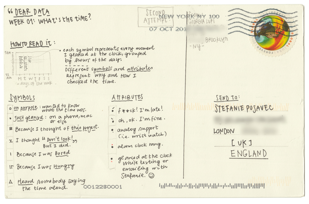
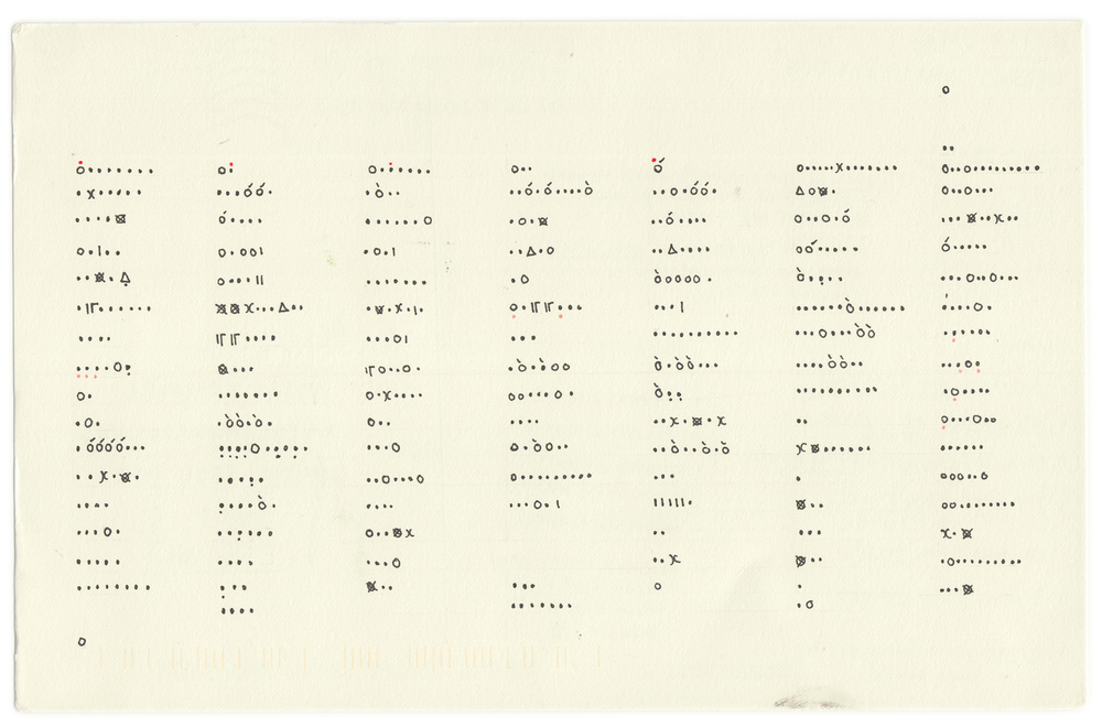
In her "Dear Data" postcards, Giorgia Lupi shows her habits of looking at the clock. It's easy to record what times she looked at the clock, but simply recording a list of times is uninteresting and uninsightful. She instead puts a twist on the visualization by including what she was thinking each instance she checked the time. This perspective provides us a look into her mood throughout the day, her general schedule, and even shares some of her personality.

Image result for dear data time
Image result for dear data a week of clocks

Plug and play visualization tools may be quick and easy to use, but will present the driest data. In a world where we are surrounded by trillions of numbers, there will be dozens of ways to visualize all aspects of life in an interesting, creative way.

Wednesday, October 24, 2018

Elements of a Misleading Graphic

The internet is a vast wasteland of media sites vying for individual attention. It often seems that writers for these sites will employ any means neccesary to grab a reader's attention. In many cases, the flashy object to pull in that reader will be an information graphic. Flashy and colorful, a graphic might command the fleeting attention of a revenue generating reader by raising an interesting question or providing insight into a topic the reader finds interesting. The attentive reader may be able to identify many of these for what they are: advertisements rather than tools for communication.

Sure, many of these may be factual and insightful, but if their primary objective is to draw attention, you can bet your bottom dollar that many will be incorrectly displaying the data, or may be intentionally misleading if they are made to support a specific argument. Cognitive bias proliferates across internet forums for hot issues in social trends, politics, and religion. Writers are encouraged to create a graphic misrepresenting the data if it supports their opinion or argument. (See my post on 8/28 for an example of a misleading political graphic.) These graphics do not need to be blatantly untruthful, but can distort or obfuscate the real story the data tells.

The three ways a writer may deceive the reader are:

1) Hiding relevant data in order to highlight only the portion benefiting the story
2) Displaying too much data to downplay or minimize reality
3) Representing the data with the wrong type of graphic, so that it is easily confused or simply hard to read

Monday, October 15, 2018

Natural Color Schemes

Samantha Zhang, the graphics lead at GraphiqHQ, writes about choosing the right color palette.

Zhang remarks that choosing a color palette to best represent data in a visualization can be more difficult than it might first seem. A graphic designer must give extra thought even when working from existing color palettes,  because they may have been created to serve a purpose other than that the designer is trying to serve.

For instance, the below color palette is visually appealing:


It represents ten hues in two shades each. The shades are all close, and the hues are spaced far apart. This color palette works really well for user interface design. To represent data, it doesn't work as well. To effectively represent numerical data, we should use a gradient of a single hue. For example:


Some hues will work better than others. The human eye is better at differentiating subtle shades of certain colors than others. For example, for the vast majority of people, it is easier to pick up on slightly different shades of blue than shades of yellow. For this reason, a graphic designer would be unwise to choose to represent data by a yellow gradient.

Monday, October 8, 2018

The Graphics Team

In the second half of The Functional Art, A. Cairo interviews a number of individuals from the graphics desk of several high-profile newsrooms. Steve Duenes and Xaquín G.V. are the graphics director and editor at the New York Times, Hannah Fairfield was the graphics director at the Washington Post, before she too went to work for the New York Times. Cairo discusses with all three how the graphics team works together to publish a beautiful visualization.

Discussion of both newsrooms highlighted the individualism of the members on the graphics team. Each person on the graphics team has their own journalistic curiosity and will to bring a story to life. Each member also comes with their unique backgrounds and expertise. Some may be very good at one type of graphic, while others have a good understanding of how everything fits together. Each member of the graphics team will bring their own flavor to a story, and working as a team, will find the best angle to bring light to a story.

When addressing a question about workflow management, Fairfield mused that often journalists from another department would come and ask for a specific graphic. As the manager of a team of individuals, she knew that a graphic created from scratch by someone on her team would be much more creative and cohesive than something made-to-order. She would tell the other journalist "I will hand off this graphic to someone on my team I trust will do a good job. You won't get exactly what you're asking for - you'll get something even better."

Tuesday, October 2, 2018

Visual Understanding

Each idea requires a very specific amount of information. Some ideas may require a lot of information, while others may be conveyed with something as simple as a dot or a line. If there is an imaginary scale on which one end is complete photorealism, and the other end is total abstraction, each idea can be best conveyed by placing it at one point on this scale. Too much information will muddle the message a graphic intends to deliver, and too little will of course make the graphic useless.

In The Functional Art, A. Cairo briefly explains why we use clear, simple illustrations. As humans, we have somewhat limited mental resources. Once our eyes carry an illustration to our forethought, our mind gets to work picking it apart, discerning what it can from the proportions and symbolism of the illustration, and comparing what it finds to similar structures in our memory. Our mind can only do so many things simultaneously. To quicken the speed of understanding, a graphic artist can remove any pieces of the illustration which do not directly lead to understanding. An example given in the book suggests that if a graphic is intended to show how to open an aircraft door, the textures in people's clothing is extraneous, and can be removed.

Charts can be made more readable by keeping the count of types of objects low. Research suggests that our fastest memory can only hold counts of to seven. A chart or data visualization can be made easier to comprehend by keeping the number of types of elements low. For instance, if encoding by color, a chart with five colors is preferred to a chart with ten, so that the reader does not need to constantly refer to the legend. In many cases, it may be appropriate to split a chart into multiple pieces to reduce the required memory for each chart.