Form and Function
The objective of any data visualization is to serve as a tool to communicate some message to the reader. Every tool has a purpose, and the first step in creating this tool should be to define that purpose. Ask "How will the reader use this tool?" The answer should determine how the graphic is constructed. The intended use of the graphic will dictate its form, in order to facilitate its reading and to avoid misinterpretation.
A well-constructed data visualization will serve several purposes. It should present the data at the right scale so that individual values are understood. These values should be organized in a manner that logically directs the reader towards the overall message. The graphic should be constructed so that individual values can be compared, and so that the reader can understand patterns and relationships in the data at a glance.
The following is a famous example of a graphic constructed without following the above rules, which did not convey its intended message effectively.
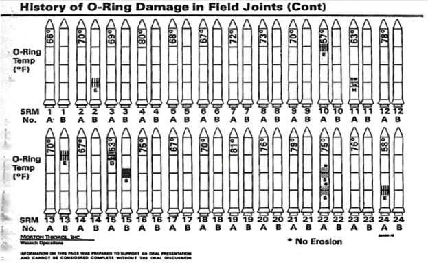
On January 22, 1986, the US Air Force had scheduled to launch a spy satellite into low earth orbit, just days before the Soviet Union planned to launch a satellite with the same purpose. The satellite was to be carried on the space shuttle Challenger. The launch was delayed due to weather over the atlantic, then delayed again, and again. Now five days later, under pressure from the Air Force, NASA management was eager to launch the shuttle in the cold early morning. Just hours before the launch, an engineer from one of the shuttle contractors brought an objection to the shuttle's launch in the form of the graphic below.
NASA management briefly considered the graphic, then dismissed the objection and proceeded with the launch. The Challenger shuttle was destroyed because NASA did not heed this objection. Perhaps this disaster could have been avoided if the engineer making this graphic had taken an extra minute to consider his argument.
Q: What message am I trying to convey?
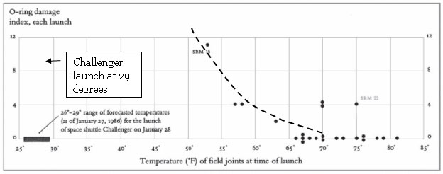
A: The frequency and severity of O-ring failures on the shuttle are proportional to the temperature, and more importantly, we definitely expect the O-ring to fail at the temperatures expected during tomorrow's launch time.
The graphic the engineer presented information on the type and location of failures from past launches, with notes for the temperature at which these failures occurred. Here they missed their mark- the message they were trying to communicate was the relationship between the temperature and the failure frequency. The temperatures should not have been a note on the graphic, but should have been a central feature. A chart like the example below would have more more clearly shown this relationship, and likely would have convinced the NASA management to delay the launch further.
posted by Unknown @ September 11, 2018
0 Comments
![]()

0 Comments:
Post a Comment
Subscribe to Post Comments [Atom]
<< Home